Preferred Home
The Situation
Could a 20+ page website not intimidate visitors?
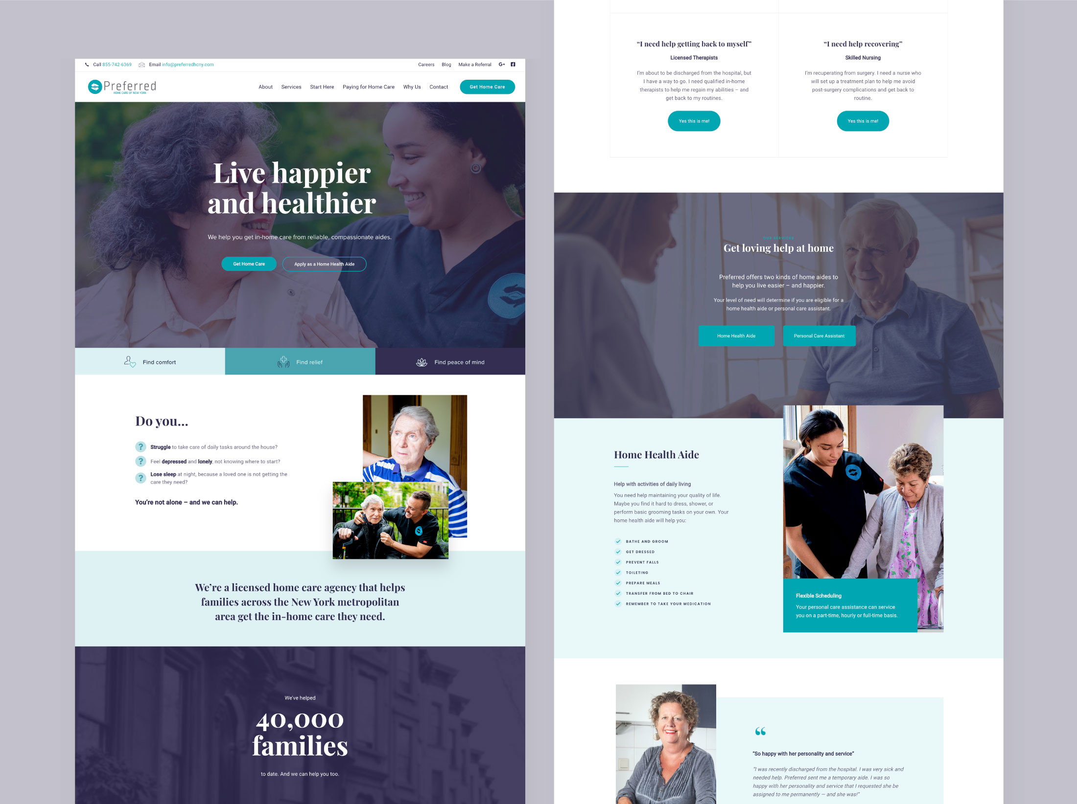
One of New York State’s largest licensed home care agencies, Preferred Healthcare offers an impressive array of services – all of which had to be displayed on their new website. The copywriter they commissioned did an excellent job of keeping the information clear and engaging. But the pages of lengthy copy posed a visual challenge: How could the site be designed in a way that would not overwhelm or confuse potential clients?
The Solution
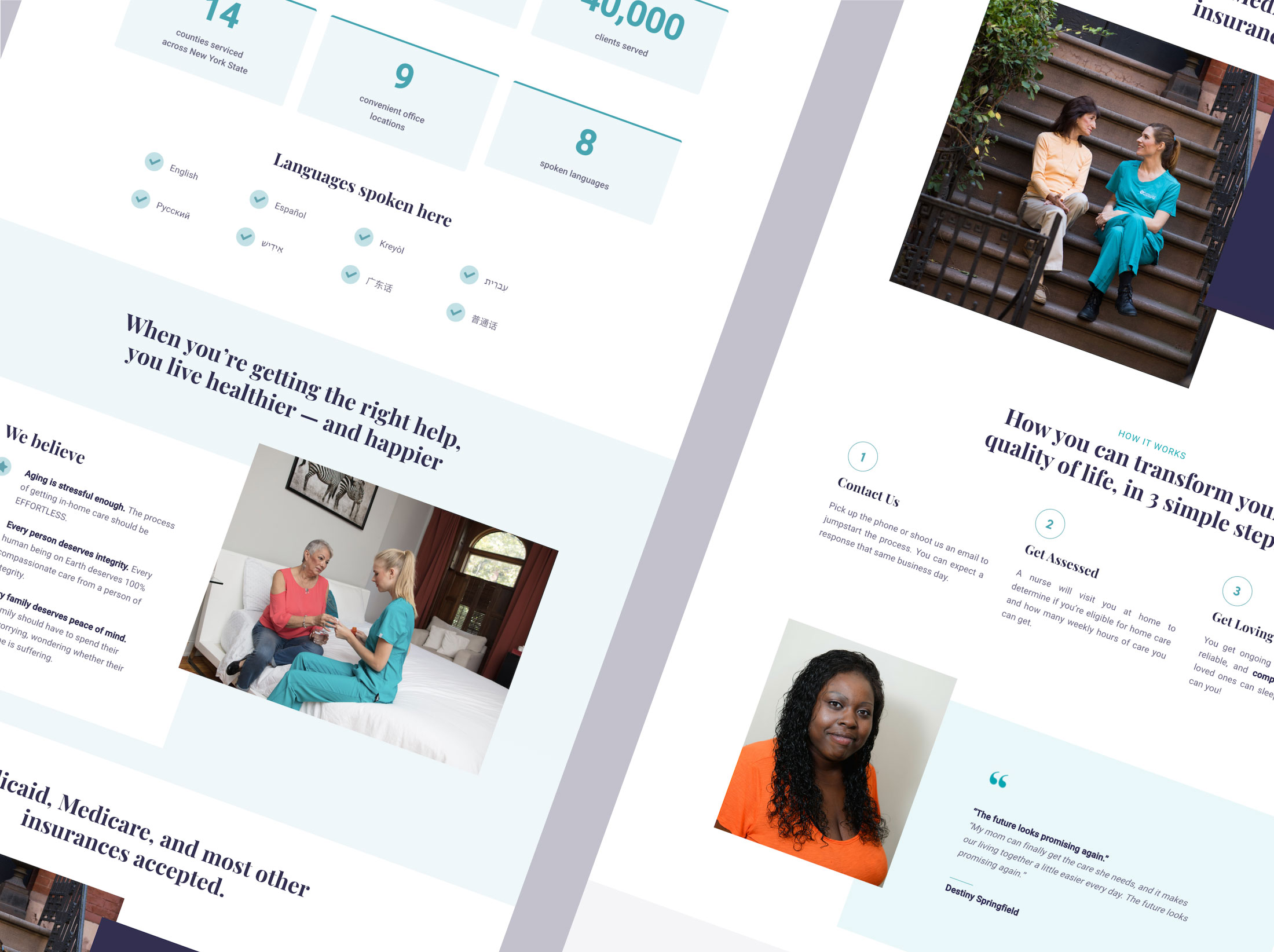
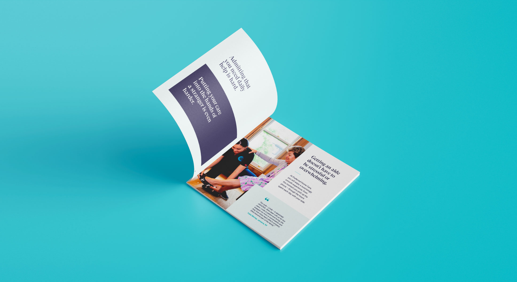
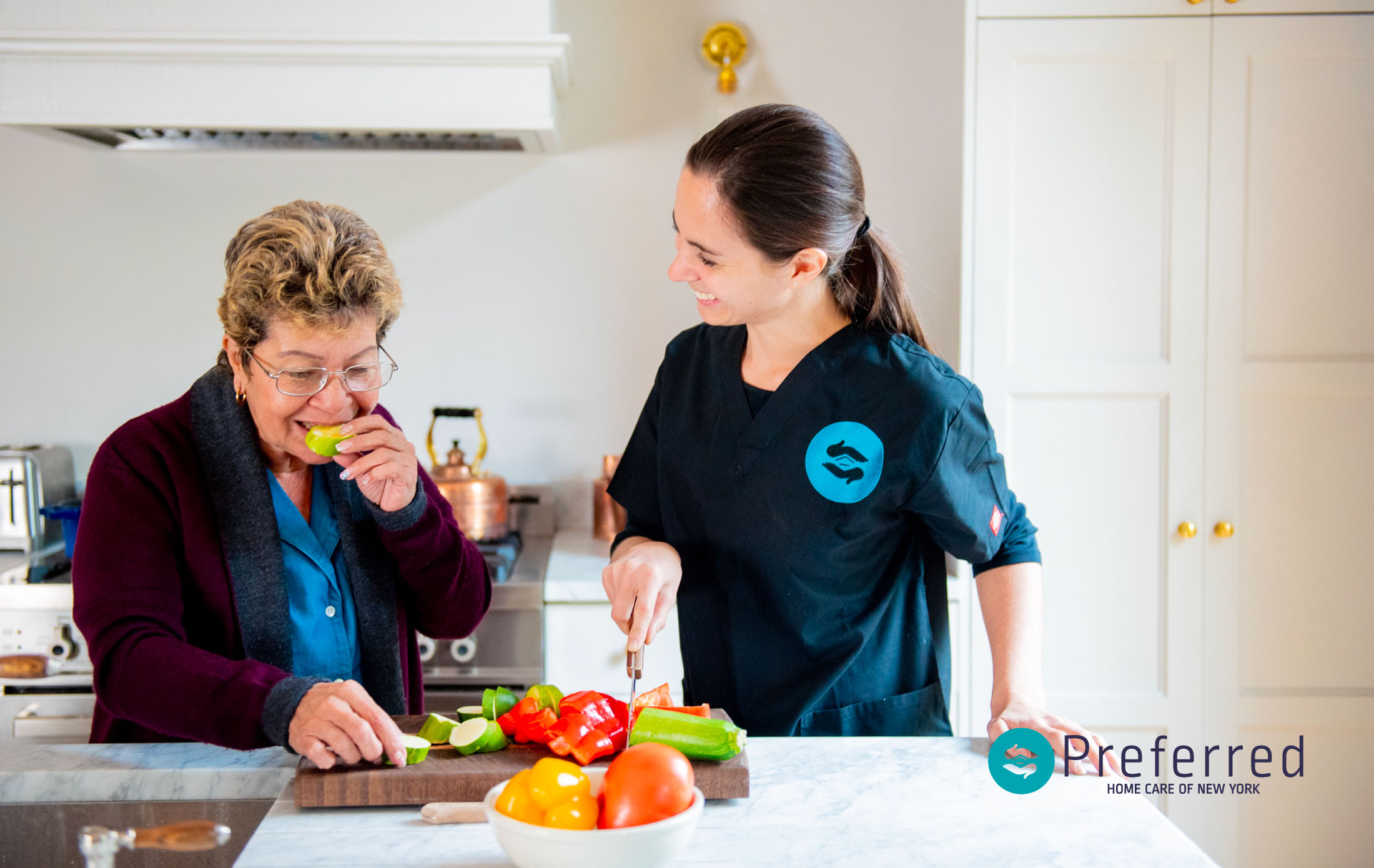
Intuitive, approachable, and friendly: that was our strategy for the Preferred website. We used a double-layer header, prominent menu options, and large calls-to-action, so it’s simple for visitors to find relevant information. Welcoming, trustworthy blues and lots of white space keep the design easy on the eyes. And as a finishing touch, we directed a custom photoshoot for authentic, relatable photos. The result? An easy-to-navigate, senior-friendly website that’s both inviting and informative.
