The Situation
QBlue is a healthcare survey program, the brainchild of two entrepreneurs with experience in the healthcare facility industry. The brand needed an aesthetic and interface as modern and innovative as the software itself, yet one that would not overwhelm those tasked with completing the survey or interpreting the results.
The Solution
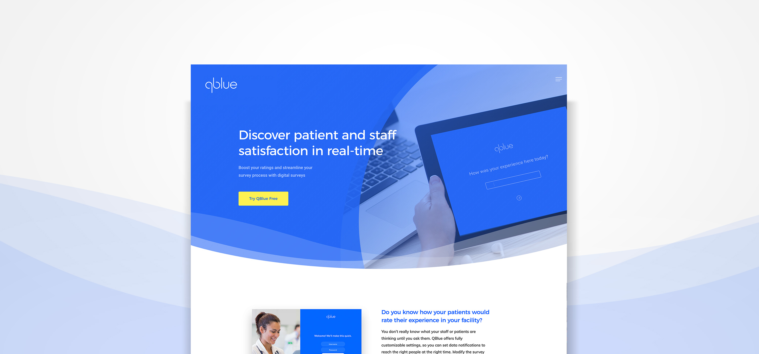
A stripped back wordmark and fresh blue and yellow color scheme comprise the brand’s contemporary, cutting-edge appearance. Friendly rounded typefaces coupled with overlapping circles and waves create an air of approachability to put even the least tech-savvy users at ease. Within the actual software, all information is presented in a clean, intuitive fashion, making otherwise confusing reports easy to decipher.
What they said
“Working with Rivky and the creative team at the Zed Group has been an incredible experience from inception through launch. They integrated design, copy and other elements to produce a cutting edge brand and website that took our startup software to the next level.”
– Yitty Deutsch and Susan Katz, QBlue